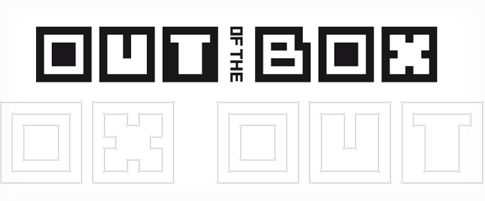
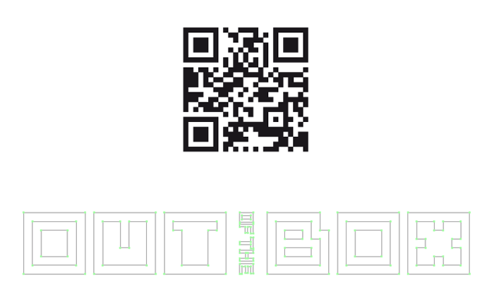
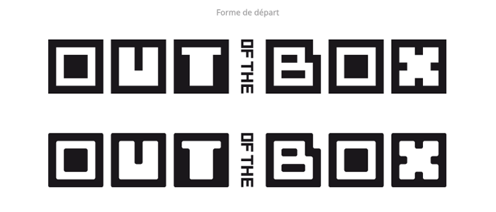
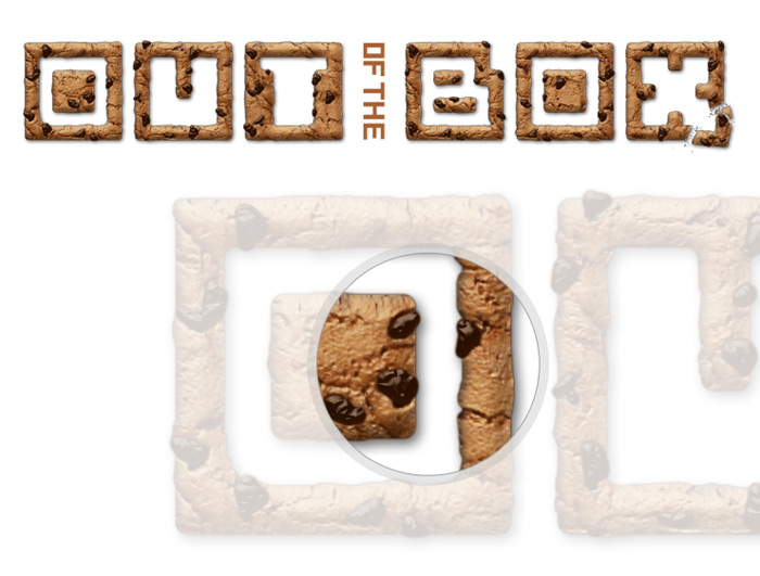
L’inspiration de la forme du titre OUT of the BOX (notamment la lettre O) vient des QR-Codes (ou flash-codes) qui fleurissent un peu partout dans nos magazines permettant de nous connecter à une page web ou nous fournir tout simplement des informations supplémentaires via notre smartphone.
To be in « Out of the Box » !
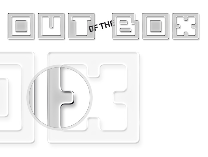
Se voulant minimaliste au départ, la mise en forme du titre s’est peu à peu épanoui dans des rendus plus complexes et décalés : d’un aspect logotype vers un visuel à part entière.
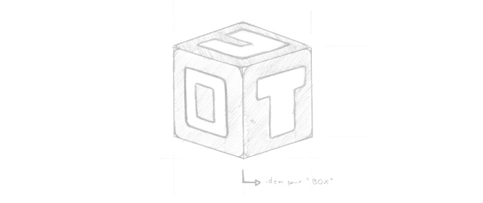
Recherches typographiques diverses pour OUT of the BOX
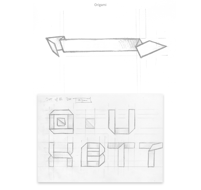
Recherche typographique style origami pour OUT of the BOX

Recherche typographique style QRcode pour OUT of the BOX
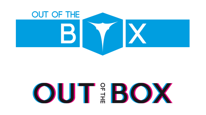
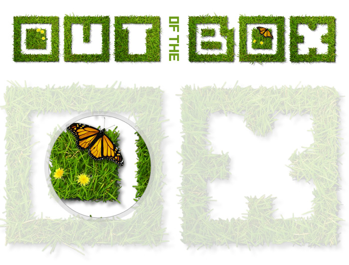
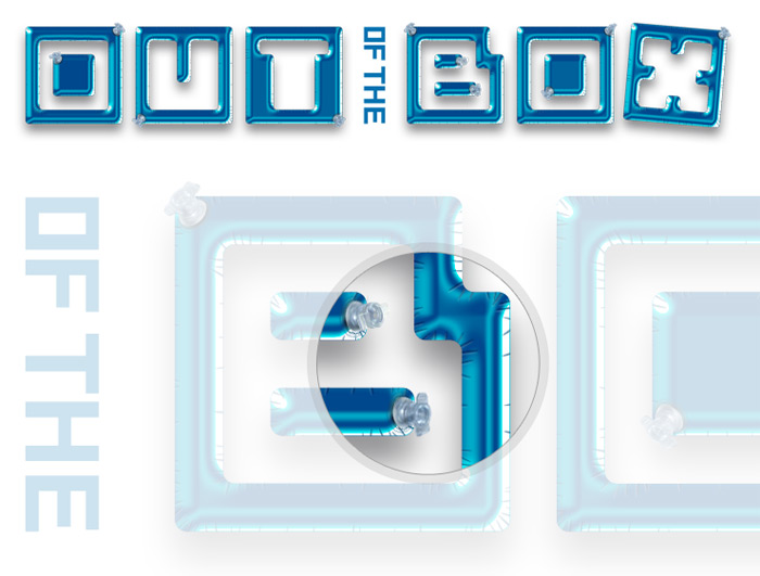
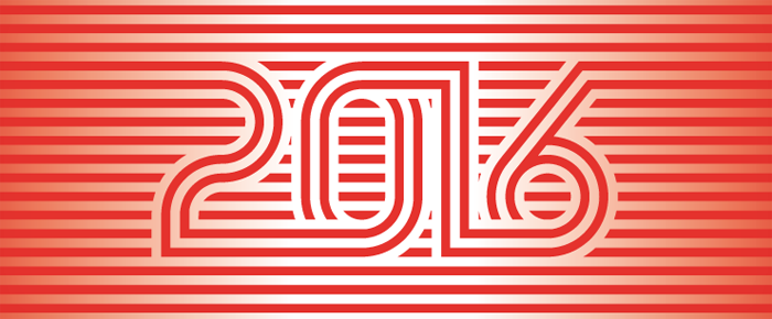
Diverses styles de rendus typographiques pour OUT of the BOX
Réalisation du magazine d’entreprise OUT of the BOX

Magazine OUT of the BOX 2015
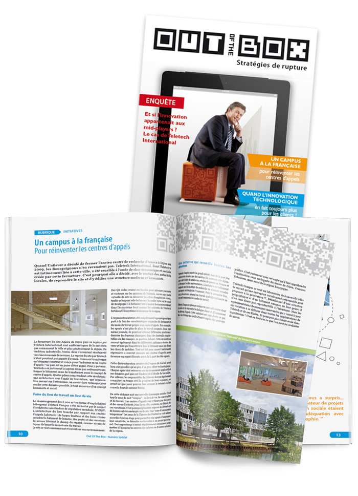

Réalisation visuel OUT of the BOX

Partager la publication "Travail sur la forme et le rendu graphique du nom d’un magazine d’entreprise Out of the Box"

Laissez-moi un petit mot !